
Color-Splashtastic
Founded
14
Years Ago134 Members113 Watchers


Comments 19
Join the community to add your comment. Already a deviant? Log In
Whats with bunch of normal photos and even some drawins being added to the Featured section of this group?
Thank you much! Great group
Thanks for the photo ad.
okay, so far EVERYTHING I've submitted has been declined, when it's just the same as what I see in the featured's folder...
would someone PLEASE tell me what I'm doing wrong that I'm forbade to submit then?
would someone PLEASE tell me what I'm doing wrong that I'm forbade to submit then?
The photos that have been submitted lack the quality that we have raised our standards to. the effect of colorsplash has to add to the photo in some way. The object left in color has to add to the subject or the feel of the photo in some way. This is not just choosing the prettiest or brightest thing to leave in color. i suggest centering the photo around something simple, like an apple, or bouncy ball, and leaving that central object in color..... self portraits, or even people really for that matter.. are not usually good candidates for the colorsplash effect.
I don't see how a multi-layer paintshop creation lacks in quality... but I guess everyone measure quality differently.
let's go into specifics,
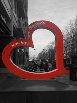
Daisy Composite: great photo and this would be a perfect addition to the gallery if it was not for one thing. it's not fully color splashed. the leaves and stems of the flowers are still green. nothing was made black and white, which should really be the majority of a color splash photo. besides this minor thing it's a great photo.
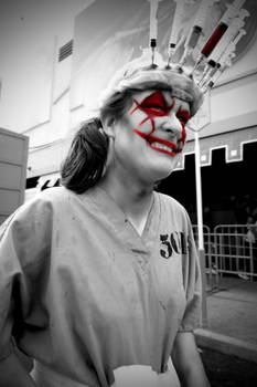
Dangerous business: Color splash photos are best if left as raw as possible. There is just too much editing here. and the phrases? one might have been really good if it added to the emotional and physical power of the photo but i can barely read any of the sayings in this photo. it's really just best to keep things simple.. it doesn't matter how long something took or how many layers it's composed of if the work does not add to the value of the photo.... and like i said before, people are just really not good subjects to color splash. it takes a really good, no extremely good portrait to be acceptable as a color splash photo.
i don't mean to offend you in any way. i know everyone sees their own art differently than the rest of the world. The deviations that you have are great, i'm just letting you know what we as a color splash group are looking for in submissions.
Daisy Composite: great photo and this would be a perfect addition to the gallery if it was not for one thing. it's not fully color splashed. the leaves and stems of the flowers are still green. nothing was made black and white, which should really be the majority of a color splash photo. besides this minor thing it's a great photo.
Dangerous business: Color splash photos are best if left as raw as possible. There is just too much editing here. and the phrases? one might have been really good if it added to the emotional and physical power of the photo but i can barely read any of the sayings in this photo. it's really just best to keep things simple.. it doesn't matter how long something took or how many layers it's composed of if the work does not add to the value of the photo.... and like i said before, people are just really not good subjects to color splash. it takes a really good, no extremely good portrait to be acceptable as a color splash photo.
i don't mean to offend you in any way. i know everyone sees their own art differently than the rest of the world. The deviations that you have are great, i'm just letting you know what we as a color splash group are looking for in submissions.
View all replies